
Branding: How To Make Your Substack Irresistible (Inspired by Apple)
Getting the right look and feel

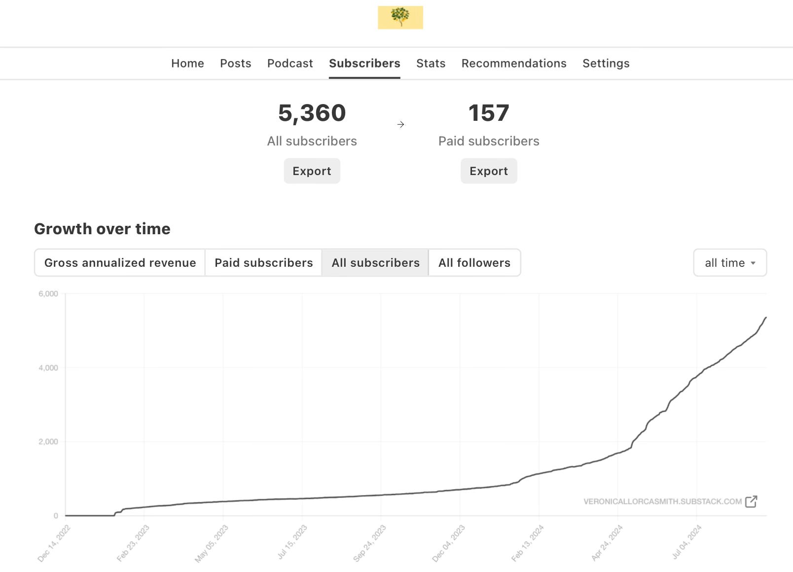
Last week, The Lemon Tree Mindset🌳🍋 hit 5,000 subscribers and the trend is going up. 157 have already upgraded to paid members and I’m averaging 800+ new subscriptions a month.
How?
Strategy: a freemium offer based on content & services
Tactics: making noise on Notes
Community: nurturing my own tribe
Marketing: creating a 360 brand
Today’s topic is branding: how to make your Substack look and feel irresistible.
Here are some of the previous articles under the Substack Series:
My 3D Strategy To Monetize My Substack: Products, Services & Community
18 Ways To Write Engaging Notes on Substack (and prove you are not a bot)
10 Cool Ideas That Helped Me Gain 100 Paid Subscribers
Upgrade now to read all the Posts, join my webinars and grow your lemon tree 💫
About branding
Did you know that the Apple logo cost 100,000 US$?
In 1977, Steve Jobs assigned graphic designer Rob Janoff the task of designing what would be one of the most iconic logos of our times.

The logo encapsulated Job’s philosophy of simplicity to perfection.
There’s a lot we can learn from Apple when it comes to branding and marketing. Today we are going to apply some of its principles to make your Substack stand out.
Full disclosure: I worked at Apple for 7 years and I’m clearly biased, subjective and non-apologetic about it.
1. Consistency
The digital space is saturated. There are over 17,000 Substack writers and everyone is screaming for attention, so getting noticed is hard.
Having an image that is consistent and memorable is key and the branding of your publication helps you be recognizable.
Colors tell a story
The human brain responds to colors and there are plenty of studies and research on the psychology of colors.

For centuries, humans have communicated through color: brides in white gowns to illustrate purity, light blue uniforms in hospitals to transmit peace, red roses during Valentine’s to show passion, black for formal occasions…
Colors matter and the ones you choose for your digital home send a signal.
Whatever your vision and your message are, colors can help you reinforce your story.
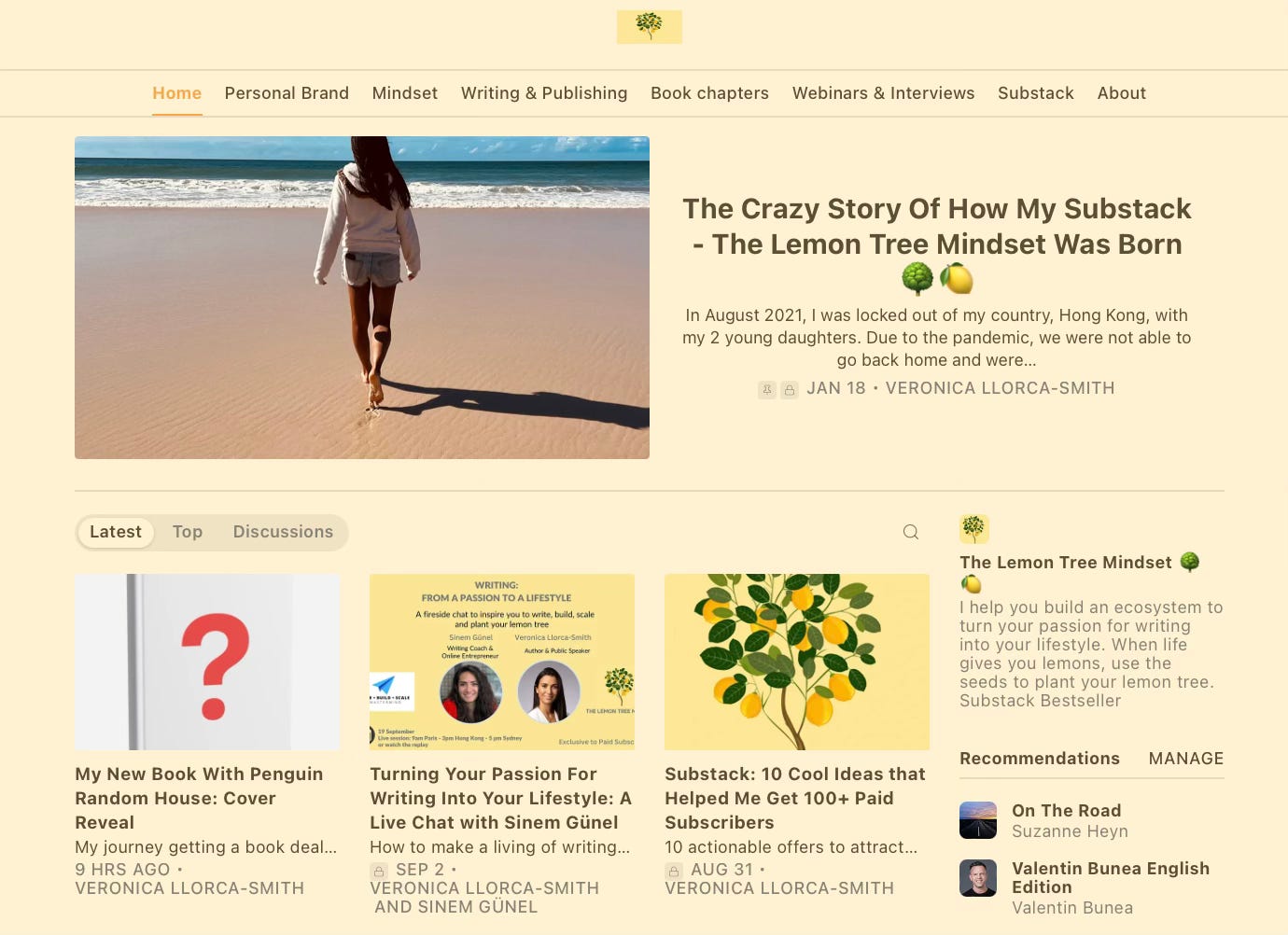
For The Lemon Tree Mindset, I picked yellow as the primary color because it tells my journey of reinvention, positivity and hope. That’s how I want my readers to feel. Darker colors wouldn’t feel consistent with my message. It would be a very sad lemon tree.
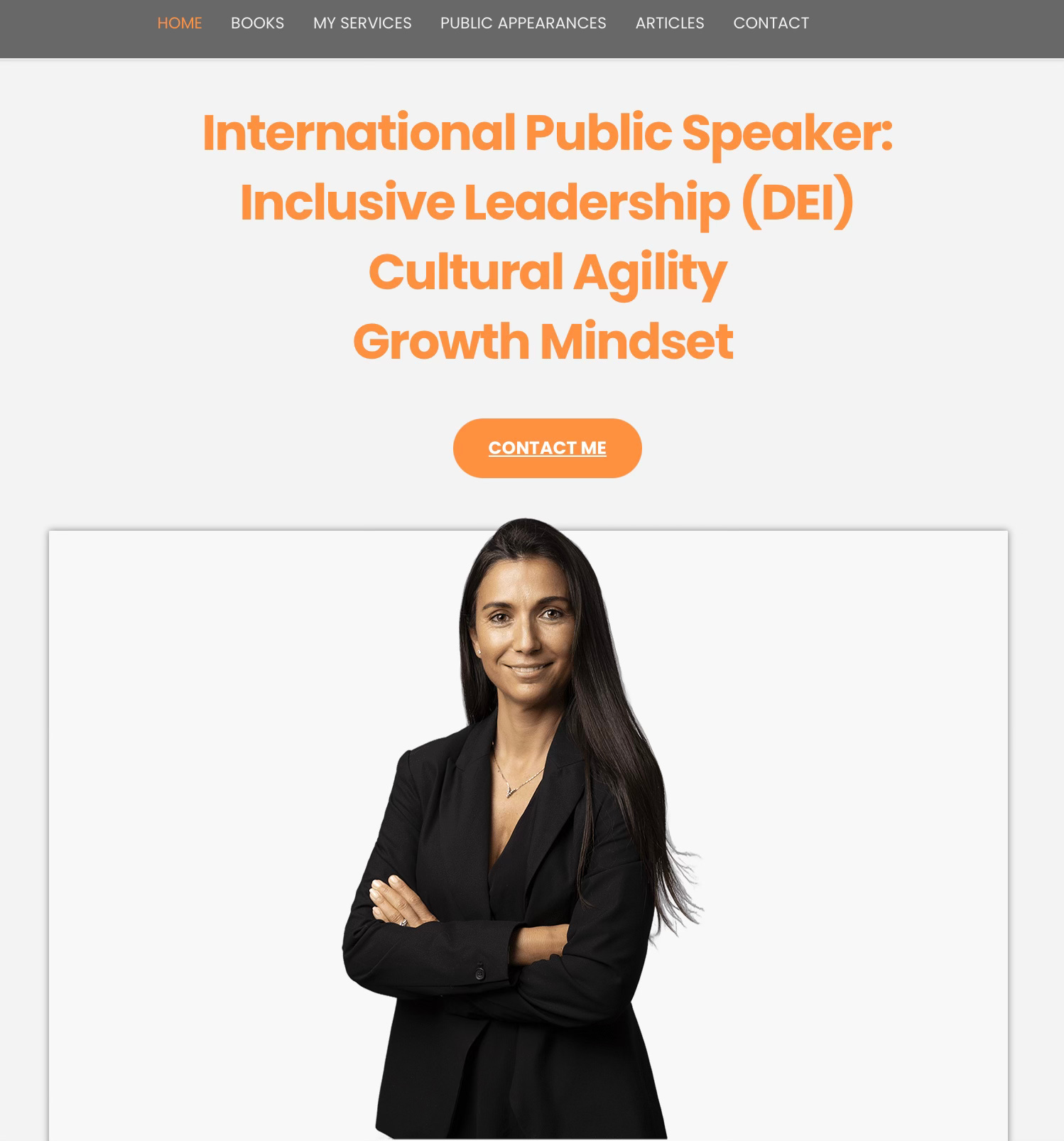
For my website www.veronicallorcasmith.com, I want to tell a different story to a different audience.
I target large organizations for public speaking, and my main goal is to transmit authority and knowledge, but I want to balance it with energy, positivity and drive. The combination of grey and orange is consistent with the image and the credibility I want to portray.
Are your colors telling your story?
The power of repetition
The human brain learns via repetition: it’s programmed to recognize and memorize images, sequences, and patterns.
Back at Apple, in almost 50 years, the logo has barely changed. The essence is the same: the bitten Apple. It’s become so iconic that you don’t even need to see the name to know you are in their store.
That’s the power of branding.
And that’s where I got the inspiration from…
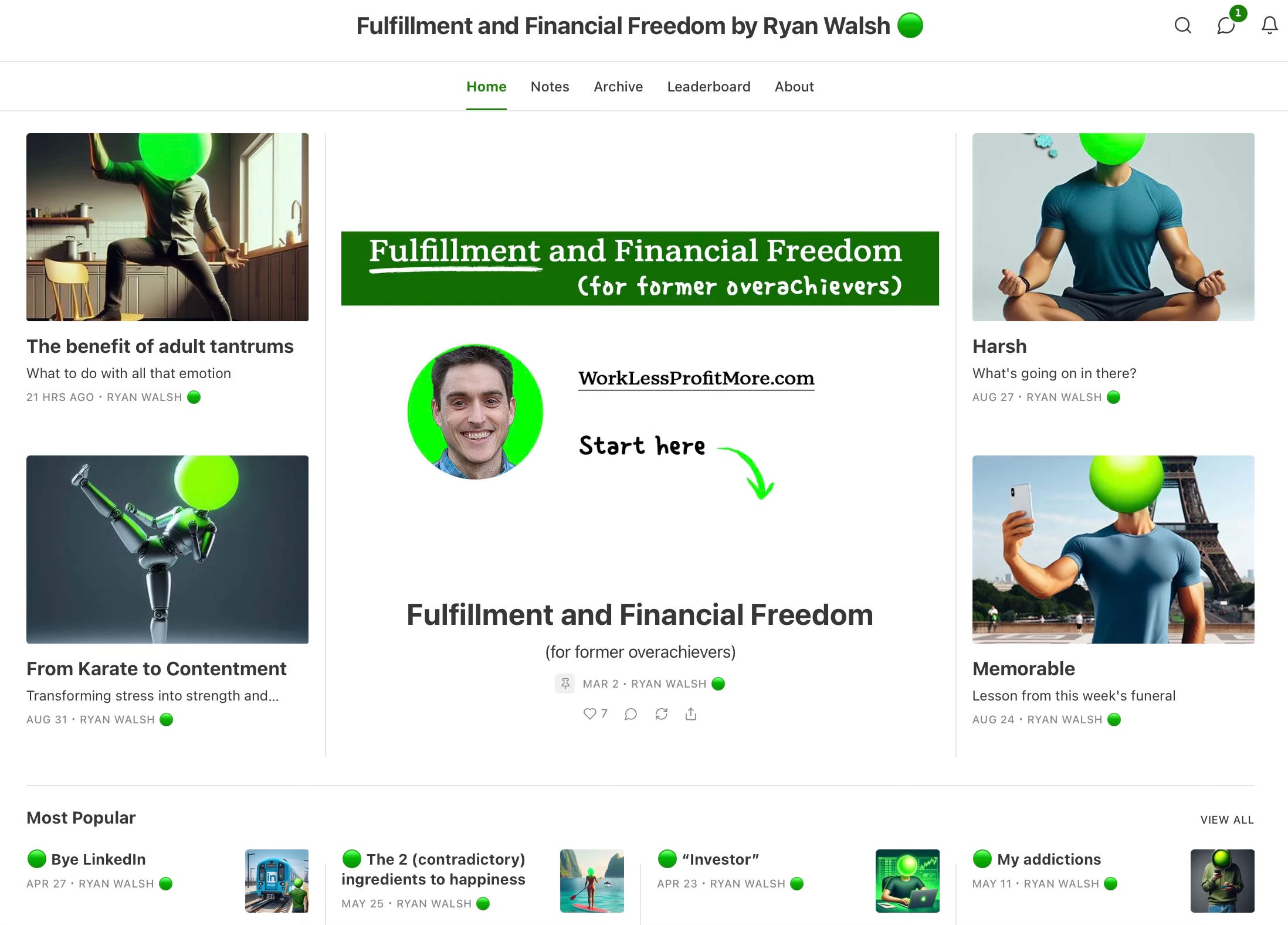
In March 2024, I made a radical change in the branding of my newsletter. I decided to use the same image for 90% of my articles: a lemon tree.
In the past, I used to post personal pictures or free images from Unsplash. It was a bit random and felt disconnected.
More importantly, it wasn’t helping me build brand equity.
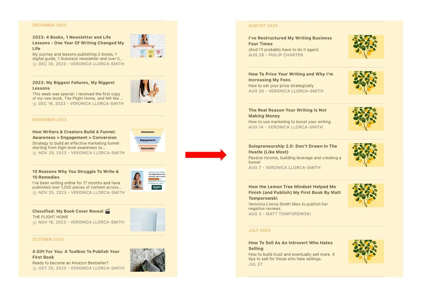
It was a bold move because I hadn’t seen others use this approach. I didn’t know if my readers would find it boring or monotonous but guess what: it was the opposite.
“Ah, that lemon tree lady again!”
Yep, lemon trees bloody everywhere.
Subconscious association.
In the past 6 months, I have received many compliments regarding the branding of The Lemon Tree Mindset🌳🍋 and other writers have even come to me for advice on branding specifically.
Because the lemon tree is the symbol of my philosophy and approach, this strategy is effective for me.
“When life gives you lemons, use the seeds to plant your own lemon tree.”
But you have other ways to stay on brand:
and run Write With AI, a Top Substack in Education. They use different images for their Posts, but they stick to a color pattern and always place their logo in the same spot.Consistent.
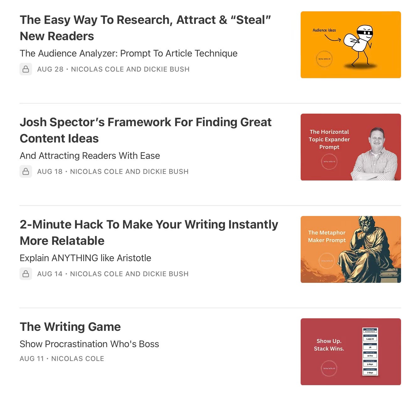
On brand.
Smart.
Can he patent that?
Brilliant.
There’s not one formula that fits all but don’t let your branding become an afterthought.
Be strategic: